
Work / Art Direction
Nexus Church
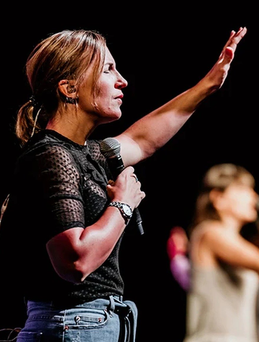
Nexus Church is a multi-department organisation with a strong community focus. I partnered with their team to lead art direction across departments, shaping how the church shows up across campaigns, events, and digital touchpoints.
Scope
Art Direction
Providing creative oversight across multiple departments to ensure the visual language stayed unified, recognisable, and aligned at every touchpoint. This meant guiding the overall aesthetic, refining execution, and helping each initiative feel connected to the wider Nexus experience.
Campaign Design
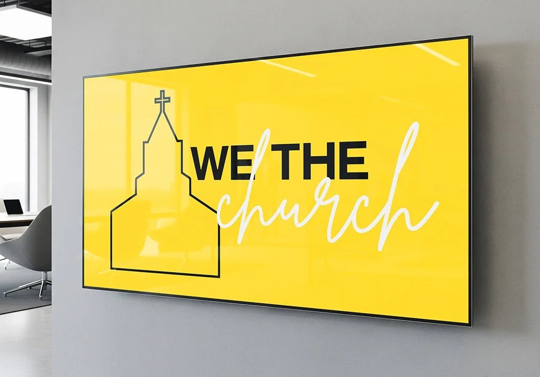
Designing fundraising initiatives, event promotions, and supporting campaign assets built to generate momentum, communicate clearly, and capture attention. Each piece was created to feel engaging and current, while still sitting cohesively within the broader visual direction of the church.
Environment Design
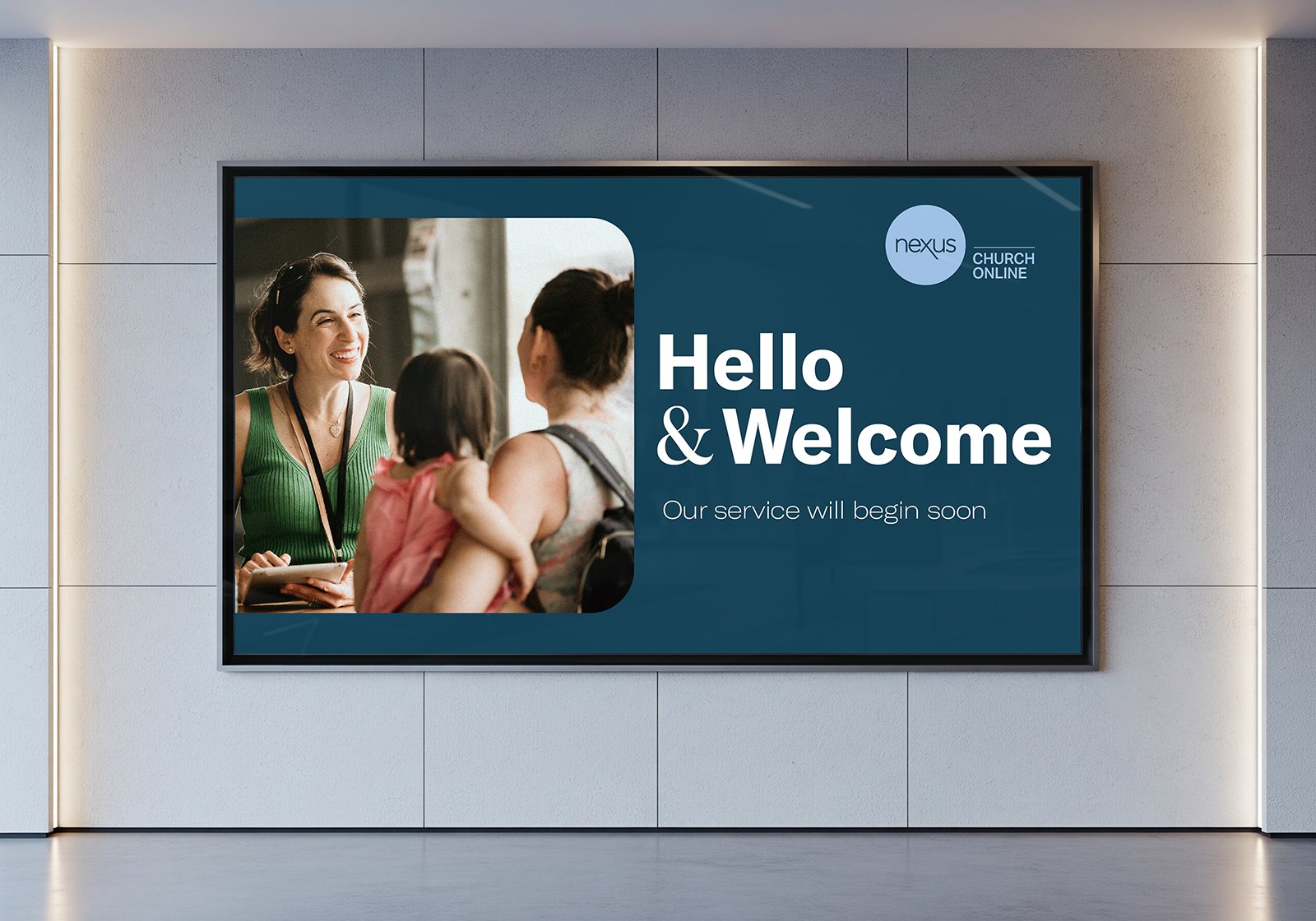
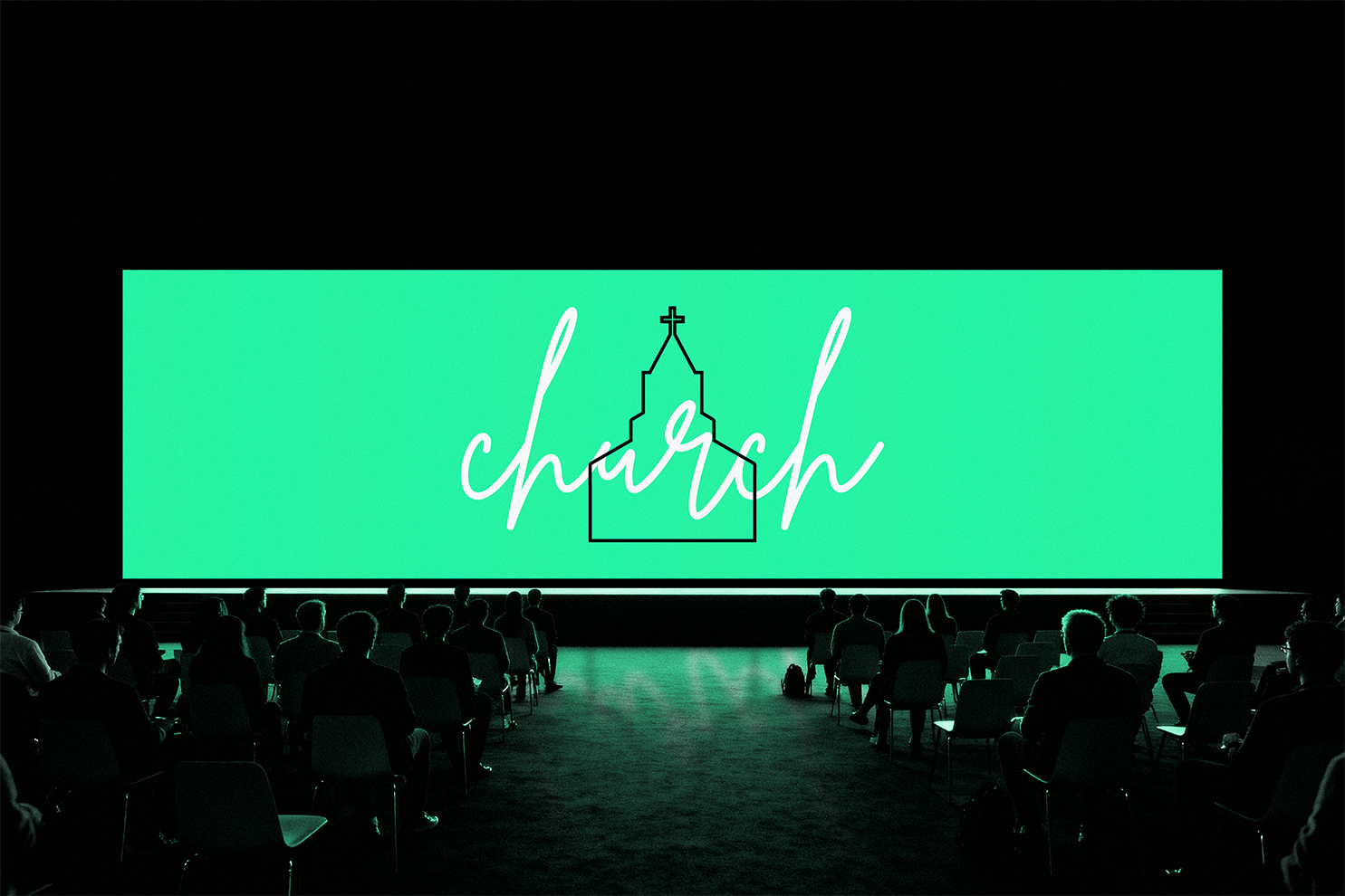
Shaping the in-service experience of each campaign through screen graphics, stage visuals, lighting direction, and selected physical elements that helped bring each launch to life. The focus was on creating a more immersive and cohesive environment that felt intentional from the moment people entered the space.
Youth Camp Identity
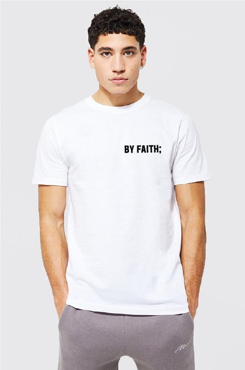
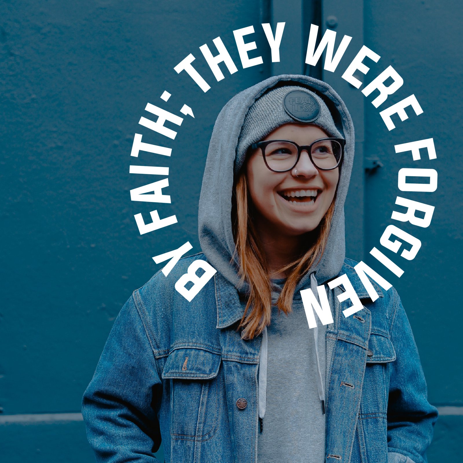
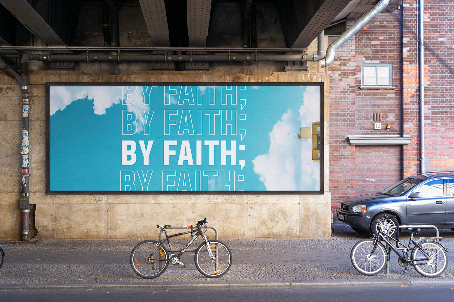
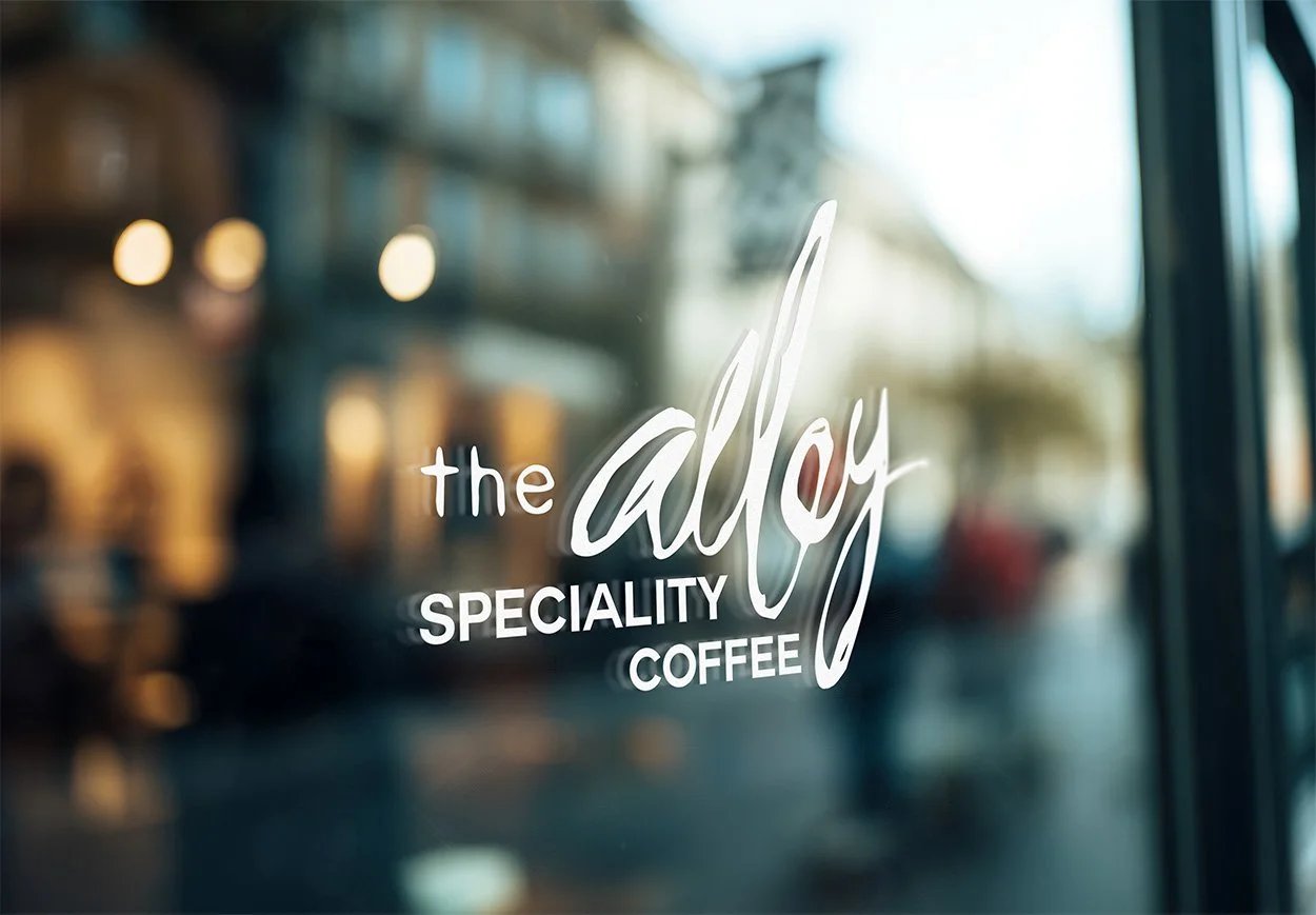
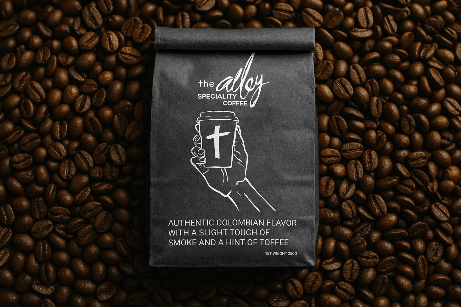
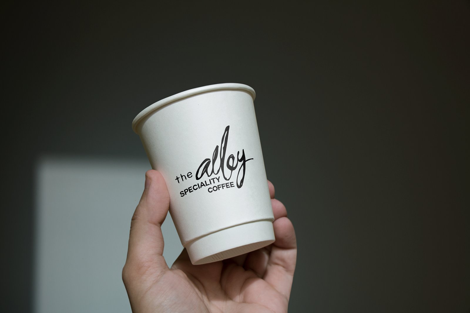
On-Site Cafe Refresh
Core Event Graphics
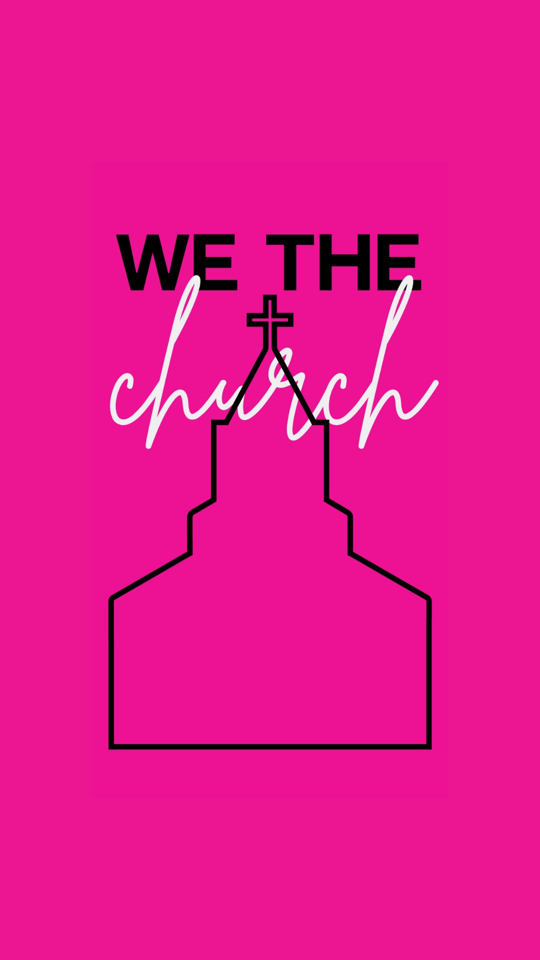
A stronger, more consistent visual experience across the church: clearer campaigns, better recognition, and creative systems that made it easier for teams to communicate with confidence across every department.
Get in touch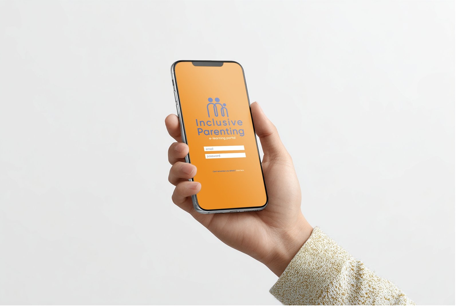
Work / Brand Strategy & Identity
Inclusive Parenting
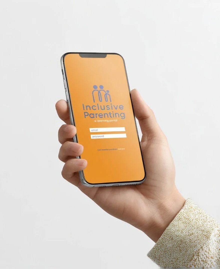
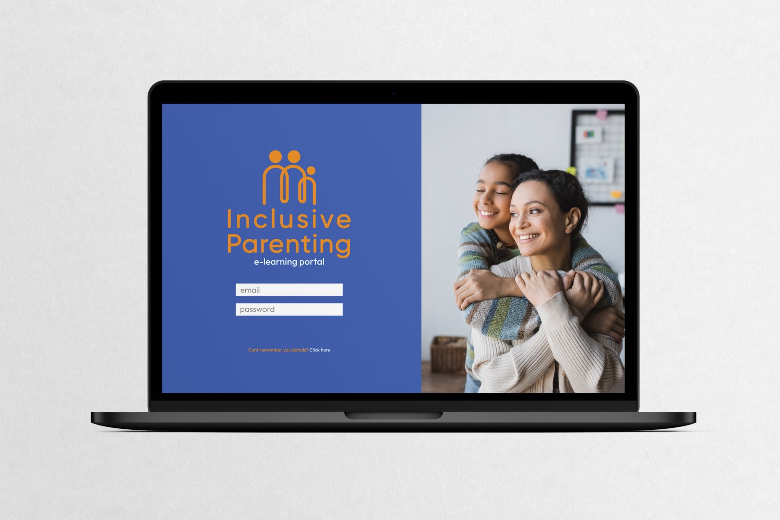
Inclusive Parenting is an education-led organisation supporting parents with disability, their families, and the professionals who work alongside them. I built a complete identity system so the brand communicates trust with clarity at every touchpoint: calm structure, clear hierarchy, and a restrained palette balancing credibility with warmth.
The challenge
Trust without cold institutional distance
Inclusive Parenting needed an identity that could carry serious, education-led information without feeling cold or institutional. The system had to stay clear and accessible across a wide range of formats, audiences, and topics, while remaining consistent enough to build long-term trust.
Objectives
What should the brand feel like at first glance?
Credible, calm, and modern. It should immediately read as a trusted, education-led organisation, not a casual community page and not a clinical service.
How does the brand stay clear and accessible?
By prioritising hierarchy and legibility. Simple layout rules, consistent spacing, and restrained design decisions so information stays easy to scan, read, and understand.
How does the system scale across platforms and formats?
The identity is built as a repeatable system, not a one-off look. It holds across web, documents, education resources, and social because the rules stay consistent and the components are flexible.
How does the brand balance authority with warmth?
Through control, not decoration. The brand leads with clarity and structure, then softens with considered colour and human tone so it feels supportive without losing credibility.
How does the brand stay consistent over time?
Clear guidelines and limited variables. A defined logo suite, a restrained palette, and a tight typography set mean the brand stays coherent, even as the content expands.
The mark
A single continuous line
The symbol is formed from a single continuous line, creating a unified family structure. It communicates connection and shared support without relying on literal or clinical cues. The mark is minimal, recognisable, and designed to hold integrity at both large and small sizes.

System in use
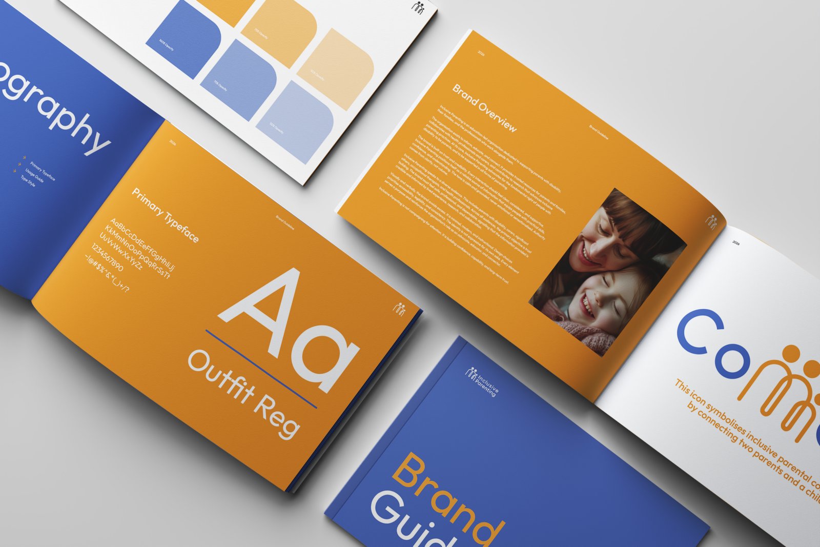
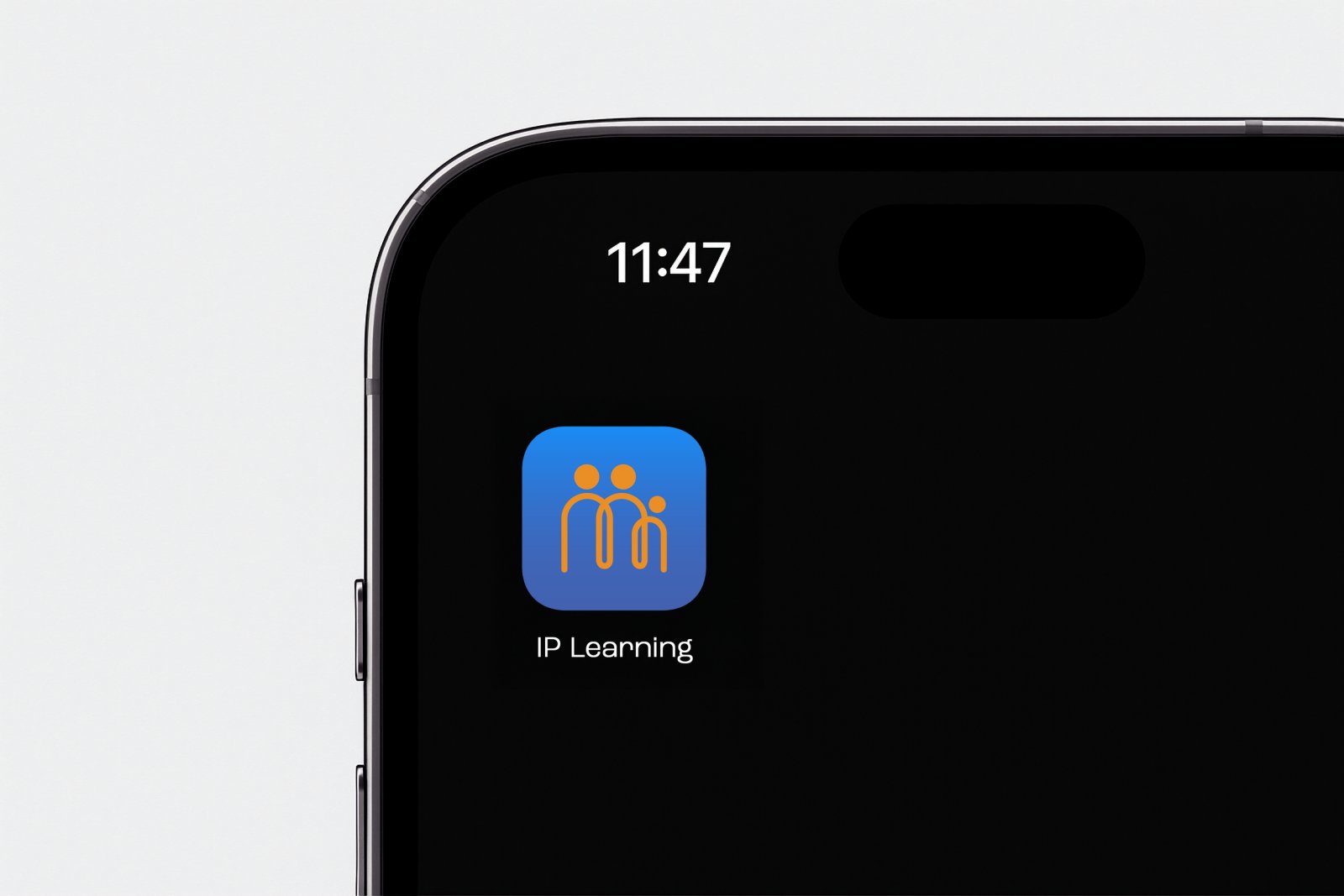
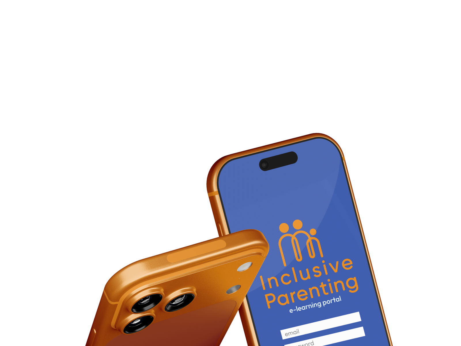
A modern, dependable identity that communicates trust with clarity and stays consistent across every format: a composed presence that supports education-led communication and builds familiarity over time.
Get in touch
Work / Brand Strategy & Retail Experience
Magnifiqué
Magnifiqué is a streetwear label built where art meets street culture, real materials, genuine exclusivity, and a quiet rejection of the declining quality coming out of mainstream sneaker brands. I developed the full system myself: positioning, identity, retail experience and packaging.
The positioning
Art, street, and the real thing
Magnifiqué is a streetwear label, not a sneaker customiser. Custom AF1s were the hook, a way into a culture already obsessed with personalisation, but the brand itself was built on something bigger: art and street culture blended into one wardrobe, real materials in a market flooded with declining quality, and exclusivity as a value rather than a marketing line.

The retail concept
Scan to order, not scan to browse
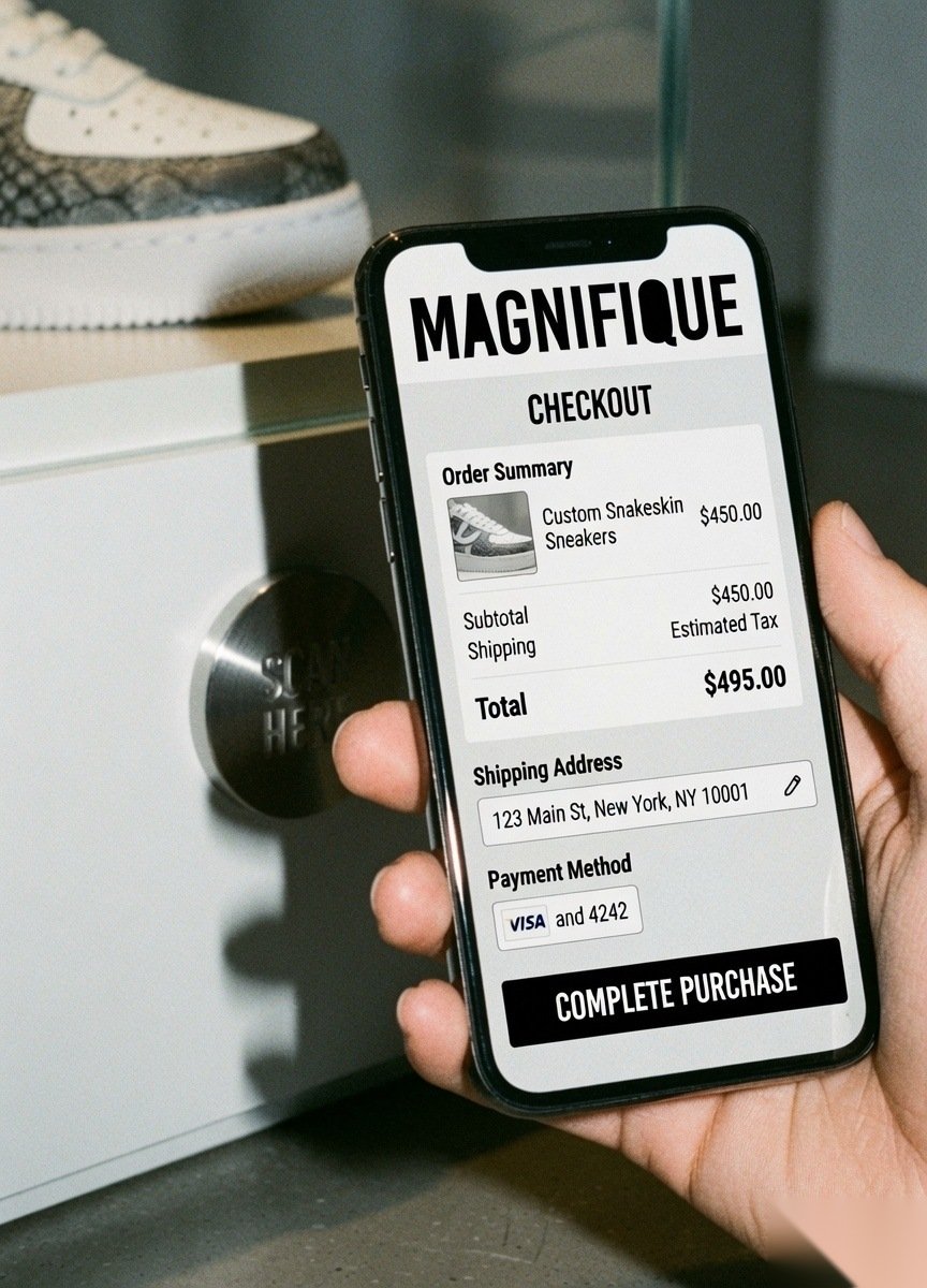
Each pair sat on a pedestal, art-exhibition style, no price tag, no rack to flick through. An NFC tag built into the display took the customer straight to a dedicated sales page for that piece, one pair, one order, gone once it sold. Owning it meant being the only one who could.
The product
Familiar shape, real material
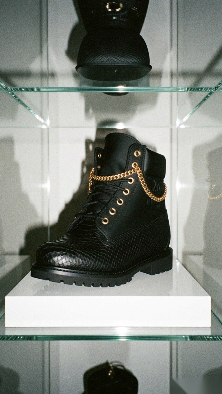
Iconic silhouettes like the AF1 and the Timberland boot, remade in genuine exotic materials rather than printed graphics, sat alongside a ready-to-wear range for people who wanted into the world of Magnifiqué without placing a custom order.
The unboxing
The last customisation, not just the box
Packaging carried the same philosophy as the product: a pop-out stencil and spray paint let the owner finish the piece themselves, so the ritual of opening it became part of owning something made to order.
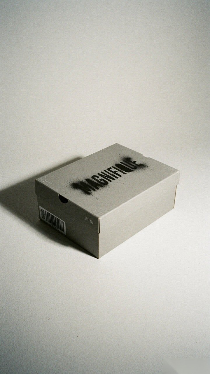
The full system, positioning through packaging, worked out to the same standard as a paying brief. A concept, and a complete one.
Get in touch